Design Tokens &
Brand Guidelines.
The visual primitive language of the OmegaX ecosystem. It balances the tension between clinical authority and modern software.
Design Philosophy
Clinical Precision,
Modern Clarity.
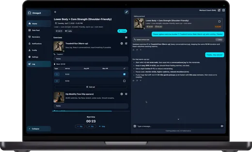
OmegaX Health's visual identity reflects what it is — a health intelligence system grounded in clinical authority and built with technical precision. Every surface balances the warmth of institutional medicine with the rigor of protocol-grade systems.
A clean, modern interface bridges the two — making complexity disappear while the depth remains.
Typography Stack
Newsreader Italic
Used for headlines, hero text, big numbers, and editorial moments.
Space Grotesk
Used for body text, UI components, labels, and navigation.
Fira Code
Used for protocol tags, version stamps, hashes, and timestamps.
Color Palette
Cyan Ink
Readable text accents, links
Cyan Signal
Glows, pulses, status dots
Primary Text
Standard reading color
Contrast Dark
Dark cards in light layouts
Dark Canvas
Atmospheric dark sections
Light Canvas
Primary background tint
Material Palette
Liquid Glass
Hero panels, nav, overlays.
background: gradient;
box-shadow: inner glows;
Heavy Glass
Standard content cards.
Milled Ceramic
Buttons, inputs, opaque frames.
border: solid rgba(225, 227, 228, 0.6);
box-shadow: subtle drops;
Logo Lockups
Authorized variations for the OmegaX identity. Use SVGs for web and print. Do not stretch, recolor, or modify the supplied assets.


